

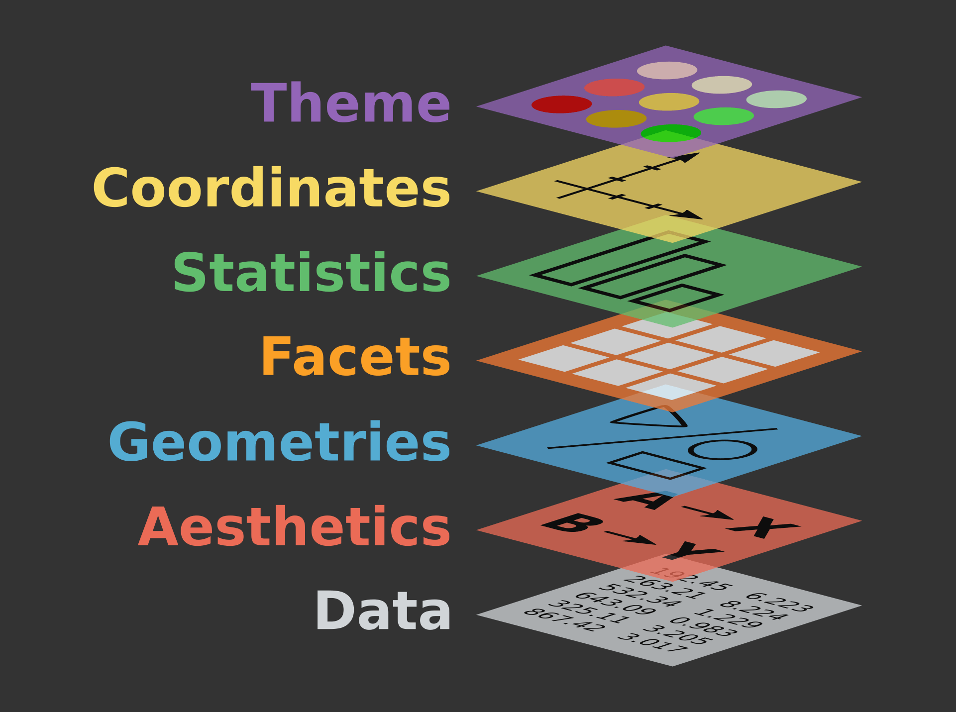
The grammar of graphics is a step-by-step framework for creating data visualizations. The key idea is that every visualization can be broken down into a set of fundamental components, and we can create any graphical figures in a logical order by specifying each component:
- Data: Underlying data the visualization will represent
- Aesthetic mappings: How the data is mapped to graph
- Geometric objects: Type of graph to create
- Scales: Specify scales of visual properties
- Coordinate system: Visual space in which the data is plotted
- Faceting: Dividing the data into subsets for separate visualizations
- Themes: Visual appearance of the plot
By breaking down a visualization into these components, the grammar of graphics provides a way to build up complex visualizations with simple building blocks. It also enables users to modify or customize individual components without affecting the overall structure of the visualization.
Basic syntax of ggplot2
The ggplot2 package in R creates graphical figures
based on the grammar of graphics. Below code chunks describes some basic
elements of the ggplot2 with an example of
mtcars dataset, which contains information about automobile
models from the 1970s.
library(ggplot2)

data(mtcars)
head(mtcars)
## mpg cyl disp hp drat wt qsec vs am gear carb
## Mazda RX4 21.0 6 160 110 3.90 2.620 16.46 0 1 4 4
## Mazda RX4 Wag 21.0 6 160 110 3.90 2.875 17.02 0 1 4 4
## Datsun 710 22.8 4 108 93 3.85 2.320 18.61 1 1 4 1
## Hornet 4 Drive 21.4 6 258 110 3.08 3.215 19.44 1 0 3 1
## Hornet Sportabout 18.7 8 360 175 3.15 3.440 17.02 0 0 3 2
## Valiant 18.1 6 225 105 2.76 3.460 20.22 1 0 3 1ggplot(mtcars, aes(x = wt, y = mpg)) +
geom_point() +
scale_x_continuous(limits = c(2, 6), breaks = seq(2, 6, by = 0.5)) +
labs(title = "Weight vs. MPG", x = "Weight (1000 lbs)", y = "Miles per Gallon") +
theme_minimal()
Let’s break down the code chunk above. In the code, the
ggplot() initialized a ggplot object with
the specified data set (mtcars) and aesthetic mappings
(aes) where x is mapped to
the weight (wt) and y is mapped to miles per
gallon (mpg).
Then, the geom_point() adds a layer of
points to the plot, creating a scatter plot:
ggplot(mtcars, aes(x = wt, y = mpg)) +
geom_point()
After that, I added another layer that can adjust x-axis scales. The
scale_x_continuous() in this example sets the limit of the
x-axis to be between 2 and 6 and specifies breaks at intervals of
0.5:
ggplot(mtcars, aes(x = wt, y = mpg)) +
geom_point() +
scale_x_continuous(limits = c(2, 6), breaks = seq(2, 6, by = 0.5))
We can then add labels and titles to the plot. Lastly, we can add some themes for better looking:
ggplot(mtcars, aes(x = wt, y = mpg)) +
  geom_point() +
  scale_x_continuous(limits = c(2, 6), breaks = seq(2, 6, by = 0.5)) +
    labs(title = "Weight vs. MPG", x = "Weight (1000 lbs)", y = "Miles per Gallon") +
    theme_minimal()
Examples of ggplot2
Pie Chart
One of the most intuitive ways to visually summarize categorical data we can think of would be the pie chart. On the pie charts, each slide corresponds to the percentage of each category. So, a category with a bigger slide takes larger parts of your data. Below graphic summarizes the United States personal expenditures by categories in 1960. We see that in 1960, people spend more than 50% of their budget on food and tobacco. Largest budgets second to Food and Tobacco is the expenditures for household operations.
library(janitor)
library(tidyverse)

USPersonalExpenditure <- as.data.frame(USPersonalExpenditure)
USPersonalExpenditure <- rownames_to_column(USPersonalExpenditure, "category")

data_1960 <- USPersonalExpenditure[,c(1,6)]

ggplot(data_1960, aes(x="", y=`1960`, fill=category)) +
  geom_bar(stat="identity", width=1, color="white") +
  coord_polar("y", start=0) +
  theme_void() +
  ggtitle("Personal Expenditure in the U.S. 1960")
But there are a few reasons why we should avoid pie charts in most cases. Firstly, people are not very good at comparing angles. In the chart above, the category for the personal care and private education seems to take similar proportion, and is hard to distinguish which one is bigger. This would be even worse if we compare two different pie charts at a time. Secondly, it looks messy when there are too many categories. For example, if the pie chart above had categories more than 10, it could have been very hard to understand.
Barplots and Dotplots
One alternative to the pie chart is the bar plot. It compares numerical values depending on a categorical variable. When it is compared to the pie chart above, we can more clearly distinguish the categories with similar values, such as Private Education and Personal Care. Please make sure you have some gaps between each bar. This is because the bar itself is on the separable categorical values, not a continuous value.
ggplot(data_1960, aes(x = category, y = `1960`)) +
  geom_bar(stat = "identity") +
  ylab("U.S. Personal Expenditure, 1960") +
  coord_flip() # Flip x-axis and y-axis
Another alternative is the dot plot. Dot plots are especially useful for absolute comparisons.
ggplot(data_1960, aes(x = category, y = `1960`)) +
  geom_point() +
  ylab("Billions of USD") +
  ggtitle("US Personal Expenditure, 1960")
Histogram
When the data are quantitative numbers over a single variable, you can use histogram. Histograms can efficiently illustrates distribution of a continuous data. Below graphics summarize the height of the Star Wars characters.
counts = sqrt(unname(colSums(!is.na(starwars))['height']))
range = max(starwars$height, na.rm = T) - min(starwars$height, na.rm = T)
bin_width = range/counts

ggplot(starwars, aes(height)) +
  geom_histogram(binwidth = bin_width)
ggplot(starwars, aes(height)) +
  geom_histogram(binwidth = bin_width) +
  facet_wrap(~ sex) # add facet to compare distribution by sex
There is no strict rules for determining the width of each bins, but general suggestion is:
- count the number of observations.
- calculate the number of bins by taking the square root of the number of data points and round up.
- calculate the bin width by dividing range (Max-Min value) by the number of bins.
But, again, there is no strict rules for determining bin width. The
default value for the number of bins in geom_histogram is
30. One important thing to remember here is that, whichever bins you
take, you should make sure that there is no space between
each bins, unless there is a bin with no data. This is
because, unlike bar chart, the horizontal axis of histograms represent a
measure of a continuous variable.
Boxplot
Boxplots summarize the distribution of the data by 5 numbers: min, 1st quartile, median, 3rd quartile, and max. The horizontal lines in the box below are the values of 25th percentile, median, and 75th percentile, respectively. The upper whisker extends from the upper edge of the box to the largest value no further than \(1.5 \times {\sf IQR}\) from the edge (where IQR is the distance between the first and third quartile). Similarly, the lower whisker extends to the minimum value no further than first quartile minus 1.5 IQR. Data beyond the end of the whiskers are called “outlying” points and are plotted individually. They often considered as potential outliers.
ggplot(starwars, aes(x=species, y=height)) +
  geom_boxplot() +
  theme(axis.text.x=element_blank()) +
  coord_flip() +
  labs(title = "Height Distributions",
       subtitle = "By Species of Star Wars Characters")
Scatter plot
When you describe relationships between two quantitative variables, scatter plots is the best choice in many cases. As we see below, when x variable value is large y variable value is also large, we can say “There is a positive (linear) relationship between x and y.”
data <- starwars %>%
  filter(mass <= 1000)

ggplot(data, aes(x=height, y=mass)) +
  geom_point() +
  geom_smooth(method = 'lm', se = FALSE) # add regression line